3x Faster
Frontend Engineering Delivery
Unified Figma variables and tokenized component libraries eliminate developer ambiguity and rework.


We transform dense, multi-tier enterprise logic into clear, frictionless user journeys. From tokenized Figma design systems to WCAG 2.1 AA accessible web applications, our interfaces bridge the gap between creative elegance and rapid engineering execution.
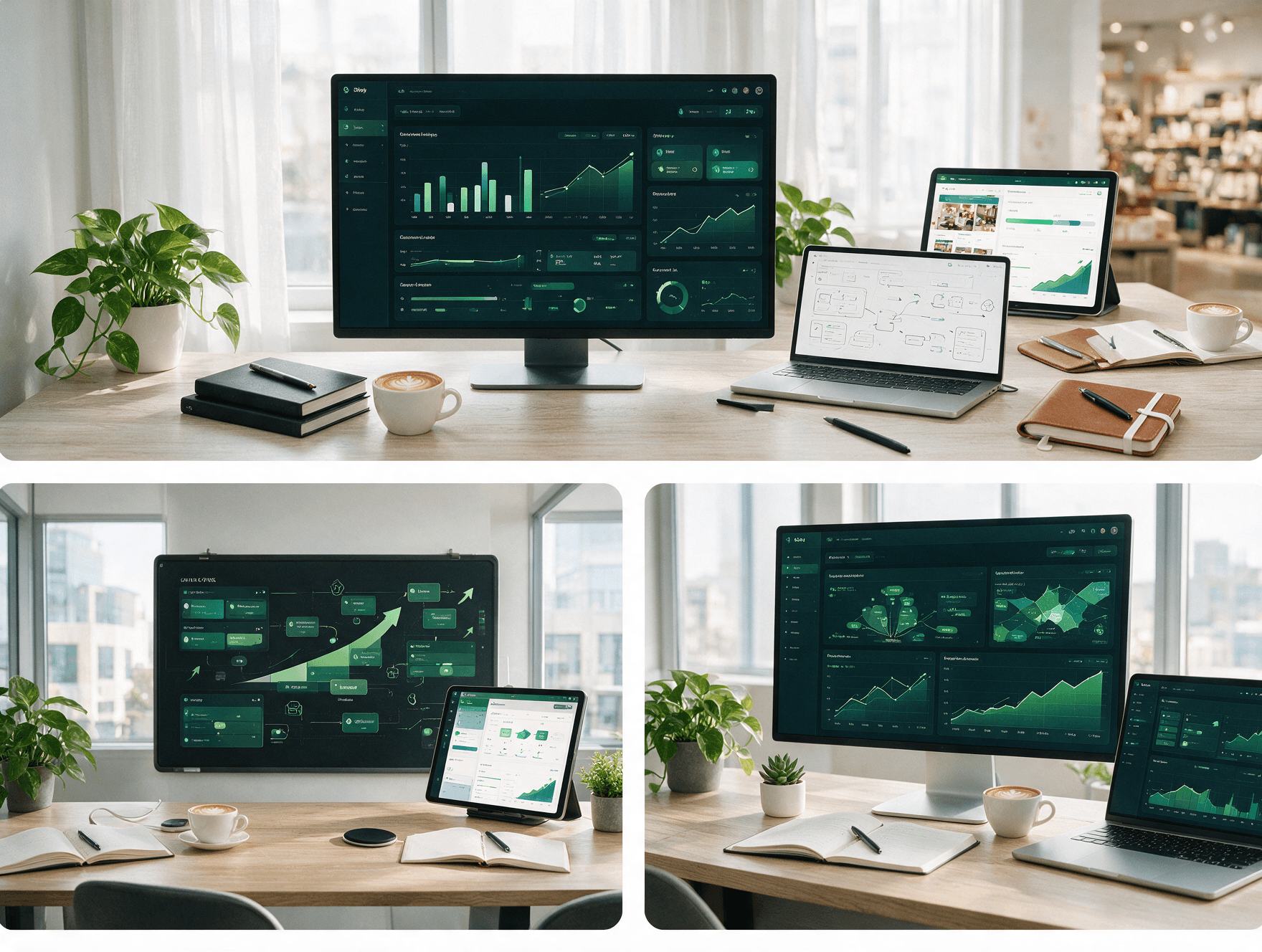
Unified Figma variables and tokenized component libraries eliminate developer ambiguity and rework.
Heuristic evaluations and task-tested information architecture streamlining complex user workflows.
Storybook component parity and automated W3C design token JSON exports ensuring zero production drift.
Explore how we engineer design systems from primitive tokens to atomic variants, automated developer handoff pipelines, and accessibility compliance.
Primitive & Semantic Variables for 100% Brand Consistency
We structure design tokens hierarchically from global primitives to semantic and component-level tokens. This allows instant dark mode theming, white-label multi-tenant rebranding, and automated synchronization with frontend codebases without manual developer translation.
Strict separation between raw hex values and semantic roles (e.g. color-surface-elevated, color-action-primary).
Mathematical spacing system ensuring visual rhythm and harmonic alignment across responsive viewport sizes.
Modular type scales with predefined line-heights, letter-spacing, and font weights for optimal readability.
Standardized z-index layers and multi-stop ambient shadows creating physical affordance and hierarchy.
How our systematic design methodology eliminates rework and aligns product managers, designers, and developers.
We analyze target user personas, jobs-to-be-done, and complex workflow paths to structure intuitive information architectures with zero guesswork.
Low-fidelity wireframes map edge-case navigation, form field hierarchies, and interaction branches to align stakeholders early.
High-fidelity screens built with 100% Auto-Layout, semantic tokens, dark mode variants, and strict WCAG 2.1 AA accessibility standards.
Tokens compile into JSON, CSS custom properties, and Tailwind configs with full Storybook component specification parity.
Our design team performs side-by-side visual regression reviews against staging builds to guarantee pixel-perfect production parity.
End-to-end design engineering designed for high-adoption enterprise software, mobile platforms, and high-conversion web apps.
Transform dense, complex operational logic and multi-tier permissions into clean, intuitive web apps designed for high-density data and sub-second task velocity.
Build tokenized, multi-brand design systems that synchronize directly with frontend codebases, eliminating design debt and accelerating sprint velocity by 3x.
Secure, authenticated digital portals engineered to provide real-time metrics, self-service account management, and frictionless document workflows.
Touch-first, ergonomic mobile experiences engineered for 60fps fluidity, intuitive one-thumb reachability, and delightful micro-animations.
Data-driven heuristic evaluations and conversion funnels that diagnose drop-offs, reduce cognitive friction, and lift sign-up and checkout completions.
Test interface decisions with real target users using clickable, high-fidelity Figma prototypes before committing expensive engineering resources.
Model how user-tested information architecture, reduced friction, and tokenized design systems drive revenue and developer efficiency.
Model how user-tested information architecture, reduced cognitive friction, and tokenized design systems directly increase conversion rates and reduce engineering overhead.
Why product leaders and engineering directors choose our architectural precision over superficial mockup agencies.
| Strategic Criteria | Generic Design Agencies | Qualtriq Design Engineering |
|---|---|---|
| Design System Scalability | Static, disjointed artboards with detached elements and unlinked colors that break as the product grows. | Tokenized, auto-layout Figma component libraries with strict semantic variables matching production code. |
| Developer Handoff Quality | Messy redlines, vague pixel notes, and no interactive state definitions leading to developer frustration and UI bugs. | Inspectable Figma properties, Tailwind theme configs, Storybook parity, and automated W3C token JSON pipelines. |
| Accessibility & Compliance | Treated as an afterthought; low-contrast text, missing focus rings, and zero screen reader considerations. | Strict WCAG 2.1 AA compliance: 4.5:1 minimum contrast, logical tab orders, touch target budgets, and visible focus states. |
| UX Research & Validation | Subjective aesthetic choices based on designer personal taste without testing with actual product users. | Empirical user testing, Maze usability telemetry, heuristic evaluations, and task-completion benchmark tracking. |
| State & Edge-Case Coverage | Only designs the 'happy path'; ignores empty states, error triggers, long text truncation, and loading spinners. | Exhaustive state coverage: Default, Hover, Focus, Active, Disabled, Loading, Empty, and Error states for every control. |
| Design Debt & Maintenance | Leaves a tangled file structure that requires complete redesigns every 12 months when new features are added. | Modular, documented design governance that scales seamlessly as your engineering and product team expands. |
Every interface system is delivered with enterprise-grade accessibility, auto-layout responsiveness, and developer parity.
Every color palette, input field, and interactive state meets strict accessibility contrast ratios and keyboard navigation standards.
Zero static vectors. Every frame and component utilizes modern Figma Auto-Layout constraints for fluid, responsive resizing.
Design tokens and components are documented with naming conventions that directly mirror React, Vue, and Tailwind utility classes.
Interactive clickable prototypes are validated through unmoderated usability sessions to verify comprehension before writing code.
A structured, transparent delivery methodology from initial discovery and user testing to pixel-perfect developer handoff.
Conduct stakeholder interviews, analyze current product telemetry, map user mental models, and draft the core information architecture.
Translate architectural user journeys into low-fidelity wireframes. Rapidly test edge cases and validate task completion flows with key users.
Design production-grade UI screens, establish semantic design tokens, configure responsive auto-layouts, and test WCAG color contrast.
Export tokens to JSON, prepare Storybook documentation, conduct developer handoff walkthroughs, and provide design QA on staging builds.
We work directly inside your existing product design and frontend engineering ecosystems.
Transparent insights into design tokens, WCAG 2.1 AA accessibility, developer handoff, and product modernization.
In traditional workflows, developers spend 30% to 40% of their time translating vague designs into code, guessing spacing values, and re-implementing duplicate components. A tokenized design system establishes a shared vocabulary: Figma variables map directly to Tailwind utility classes or CSS custom properties. When a token changes, automated scripts update the code repository without manual developer edits, cutting frontend sprint delivery times by up to 3x.
We integrate accessibility into our design process from day one. Every color combination is verified against a 4.5:1 minimum contrast ratio for standard text and 3:1 for graphical UI elements. We design interactive focus rings with clear offsets, specify logical keyboard tab sequences for keyboard-only users, and provide explicit ARIA roles and labels for screen readers.
You receive 100% full intellectual property ownership of all Figma source files, including organized pages for tokens, components, high-fidelity mockups, and clickable prototypes. Additionally, we provide exported design tokens in W3C-compliant JSON, Tailwind configuration extensions, SVG icon assets, and an engineering handoff guide with responsive rules.
Yes. We specialize in phased, iterative UI modernization. Rather than forcing a jarring overnight change, we build a modular design system and refactor the interface in isolated feature modules. This allows user testing and gradual rollout with zero downtime, preventing user churn while systematically modernizing the product.
We build high-fidelity interactive Figma prototypes that look and feel like a real application. We then run unmoderated user testing sessions using Maze with members of your target audience. We measure task completion rates, time-on-task, and misclick heatmaps, iterating on any friction points before a single line of production code is written.
Absolutely. We view design as an extension of engineering. Our designers work directly in your Slack, attend sprint grooming sessions, and conduct visual QA reviews on staging environments to ensure the final coded release matches the approved design with zero drift.